The future of browsing
Phlinx is a Chrome extension that allows you to long click any word on any site to explore it in a sidebar. The result is fewer tabs and a more focused browsing experience.
The name Phlinx derives from potential hyperlinks – things that could be links but aren’t – and the dotted line in the logo is a nod to an early prototype where such things were subtly highlighted.
Phlinx’ user interface is deceptively simple: a non-intrusive sidebar that lets you explore anything, from movies and people, to products, locations – in fact, any word in the English language.
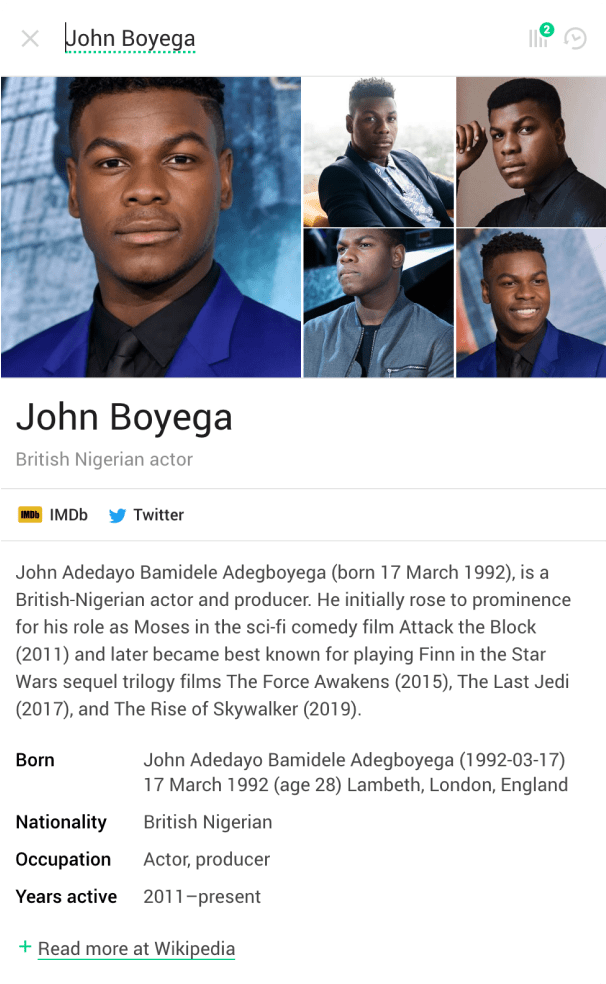
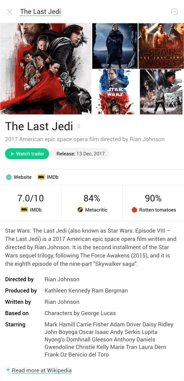
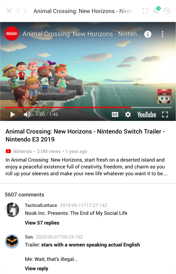
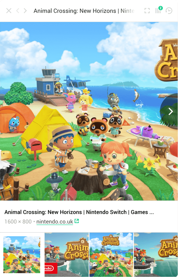
The sidebar effortlessly adapts to any type of content, whether it’s videos, images social media posts, or even links and articles.
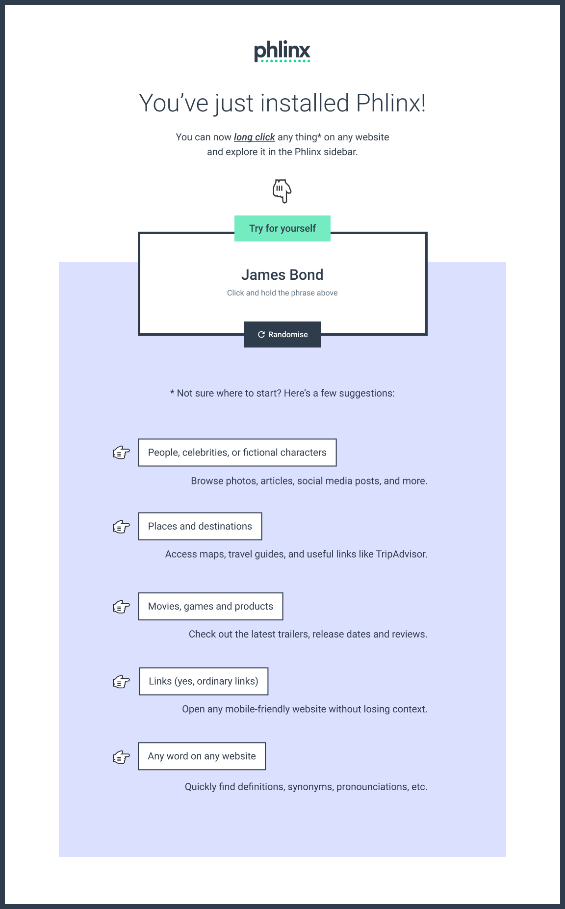
Here’s the landing page on phlinx.com. It is
designed to answer three crucial questions:
– What is Phlinx?
– How does it work?
– Why should I use it?

The introductory animation is purposfully light on detail, focusing instead on showing the core experience of exploring multiple topics in a sidebar.

To ease the learning curve, this onboarding page uses an interactive widget to prompt users to try Phlinx as soon as they’ve installed it, alongside plenty of use cases.
Espen brings a unique sense of creativity to projects, morphing mere ideas into iconic concepts. I've really enjoyed working with him. Great communication, great deliverables and a joy to work with to boot.
Addy Osmani, Google
A smashing series of books
Smashing Magazine has become a household name for anyone working with the web today, and continues to inspire and inform with a host of articles, conferences, and books.
Image Optimization by Addy Osmani is an absolute must read for anyone working with images on the web. The cover references multiple aspects of the optimisation process, encapsulated in one iconic illustration.
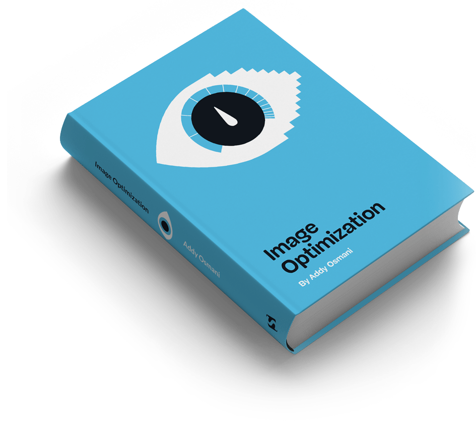
Every book needs a landing page, and part of this project involved revamping the current template to give it an even stronger visual link to the visual identity of the book.

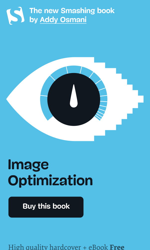
Exploiting the advantages of digital materials the cover illustration was animated to make the landing page more memorable and... eye-catching.
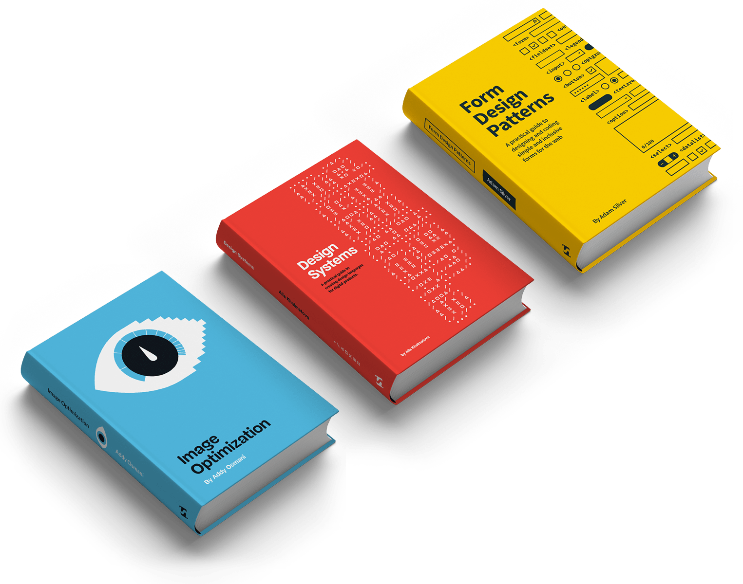
Image Optimization follows a visual language developed over the course of two previous covers, with a vibrant, three colour palette with simple vector illustrations.
Espen is a very reliable, passionate and hard-working designer with a keen eye for details and getting things done well. Always a pleasure, and highly recommended!
Vitaly Friedman, Smashing Magazine
A Smashing improvement
A short design sprint yielded a range of suggestions for improving engagement on the Smashing Magazine home page, as well as a brand new section on the site.
The first thing we looked at was navigation and search. By keeping the search field in view across all devices, we were able to increase searches by 80%.


Next came a variety of content modules for the home page, with a clearer hiearchy and more focus on current features or topics.
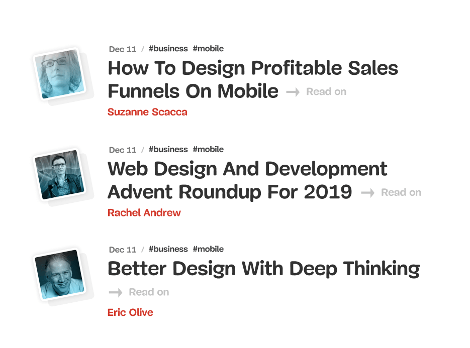
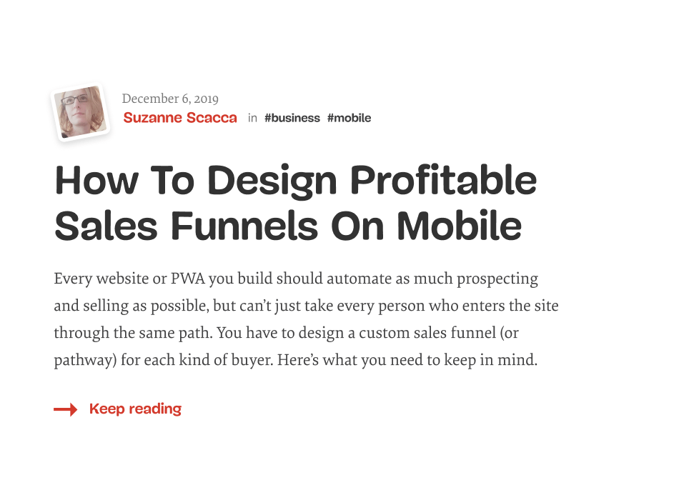
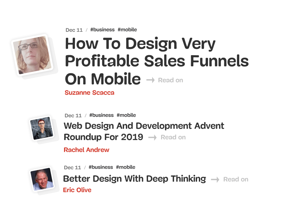
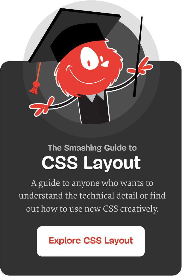
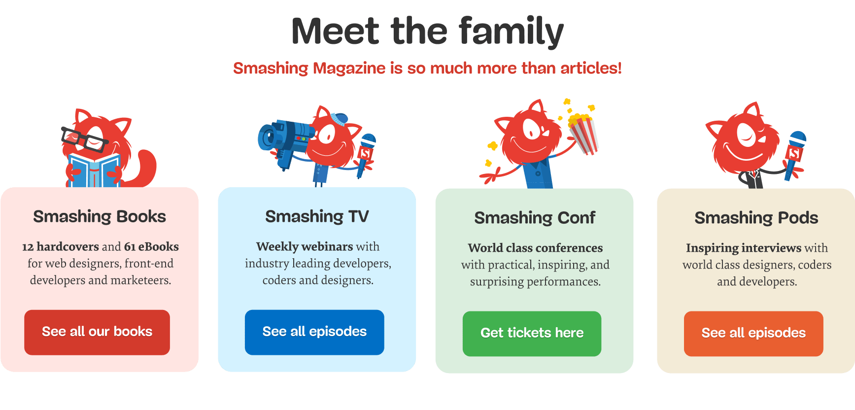
Another set of modules aimed to expose visitors to the breadth of the Smashing universe – including Smashing TV, Memberships, Topics, Conferences, and Books..
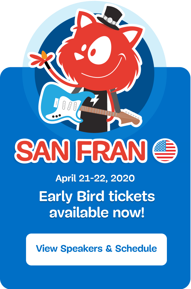
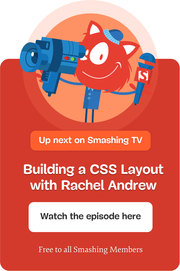
Espen is incredibly easy to work with. He is both responsive and constructive, and we truly appreciate his ability to convert our requirements into high quality design solutions.
Elisabet Molander, Oslo Kommune
Busting Oslo's climate myths
The Climate Myths initiative was set up by Oslo Municipality to bust common myths and counter popular fallacies amongst climate-sceptic constituents. My work on this project was commissioned by HyperRedink.
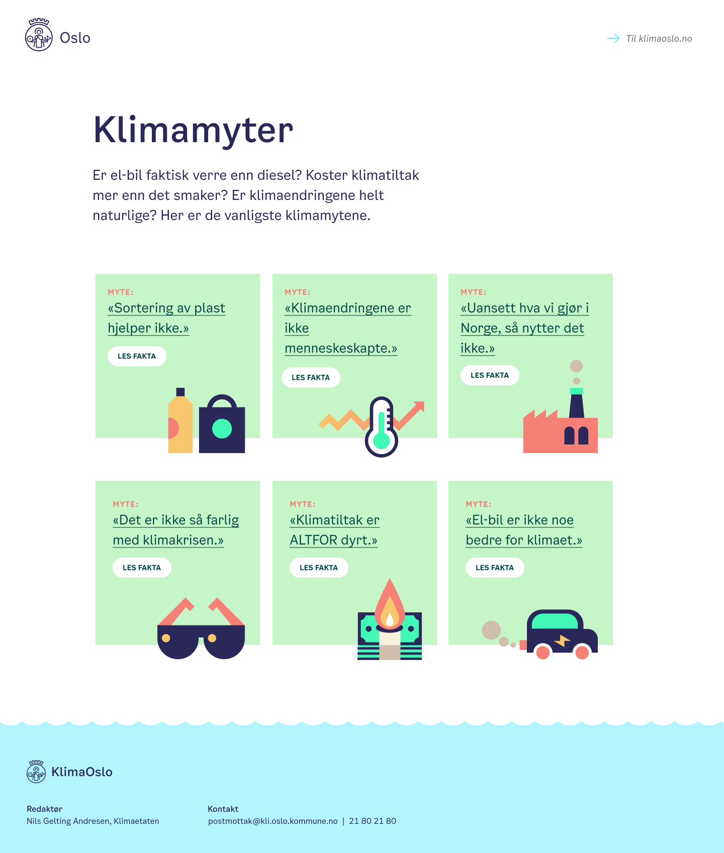
The six most prevalent myths were chosen for the initial launch, and following Oslo’s distinctive art style I created a matching illustration for each myth.

"Climate change is not man made"

"Electric cars are no better than other cars"

"Climate measures are too expensive"

"Local efforts in Norway are pointless"

"The climate crisis is not a big deal"

"Recycling plastic doesn't work"
A landing page containing every myth acts as the center of the campaign, which consists of multiple videos and articles promoted on social media.
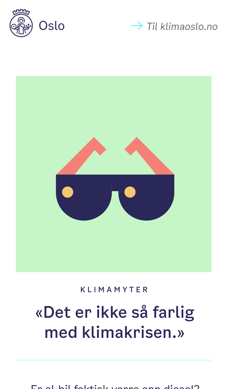
The simple style of illustration lends itself to microanimations. In this example, I've used GSAP to bring the little car to life.
Espen has a rare capacity to combine great strategic thinking with extraordinary designer qualities, along with the ability to always deliver high quality, on time and budget.
Birger Baug, HyperRedink Oslo Kommune
Finding a smarter way to travel
The Smart Travel applet was created to reassure a worrying commuters ahead of a major toll overhaul in Oslo and calculates toll cost, distance, and duration for various modes of transport. Made whilst employed at HyperRedink.
The premise of the applet is simple: how much does it cost to get from A to B on the new toll roads? How long does it take? And what are my alternatives?
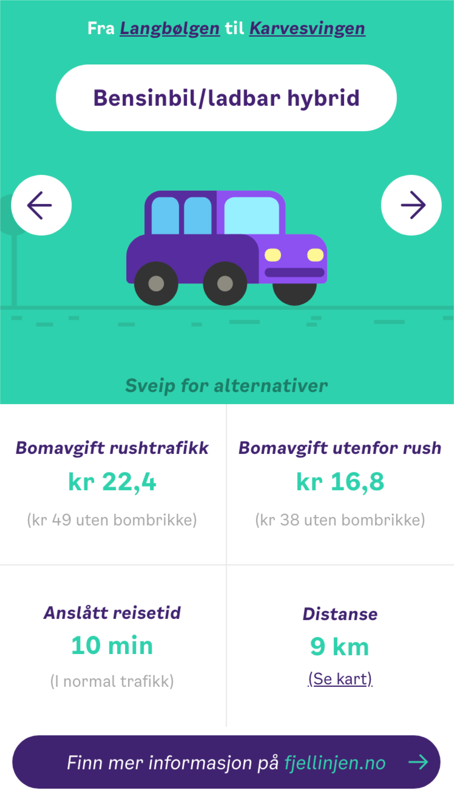
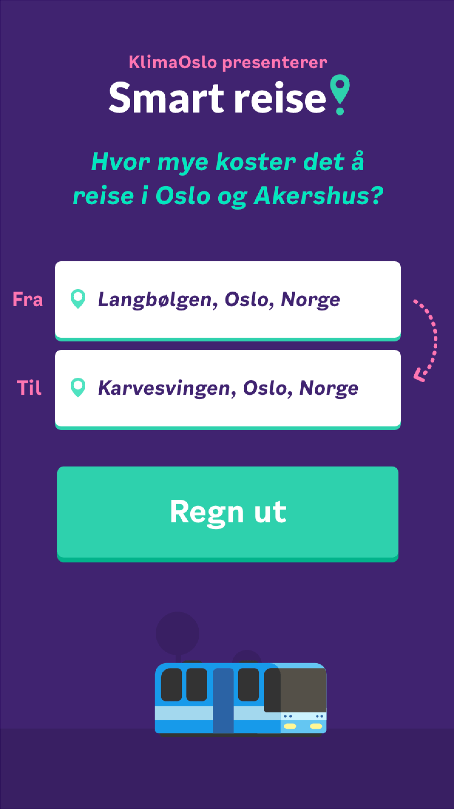
Calculations include diesel and petrol, hybrid and electric cars, public transport, as well as cycling and walking – all presented in a simple, swipeable, interface.
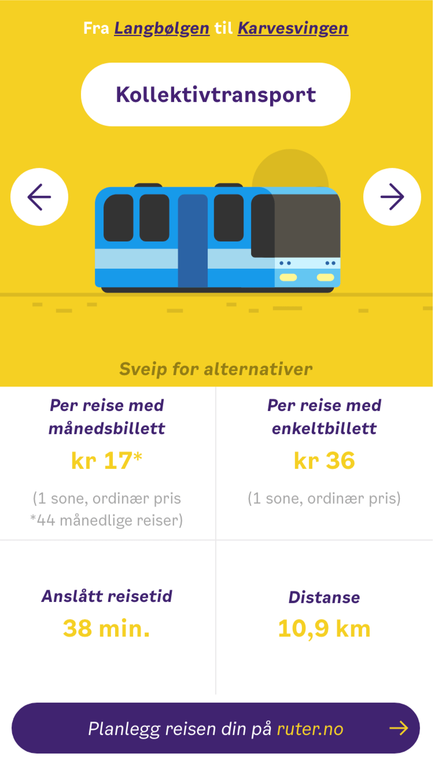
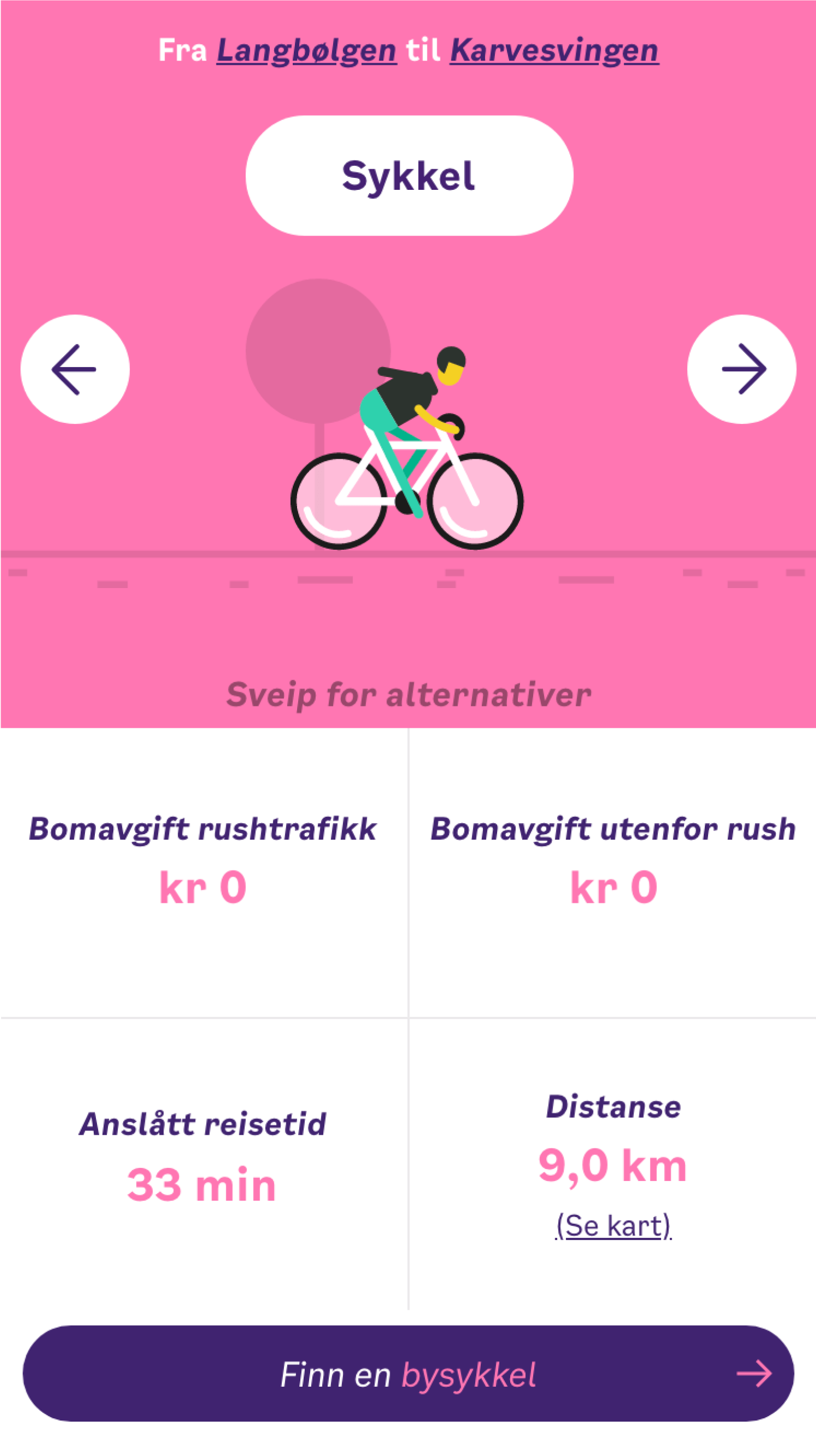
Each mode of transportation was painstakingly animated using CSS and SVG, all to give the applet a fun, relaxed appearance.
Contact
I’m currently available for client work two days a week. Get in touch to chat about your next project or organising a workshop for your team.
- Email: espen@hey.com
- Phone: +44 7309 039 740
- Twitter: @ebrunborg
- Facebook: Fuck off, Zuckerberg.
- Instagram: Fuck off, Zuckerberg.
- WhatsApp: It's complicated.